
Audio-Reactive Visuals: A Guide for Electronic Musicians
Audio-reactive visuals are images that move because of your music, not alongside it. Done well, they feel like part of the arrangement. Done badly, they look like a media player from 2003. The difference has almost nothing to do with how good your shaders are, and almost everything to do with what you connect to what. This guide explains how audio reactivity actually works, the mappings that make music look musical, and the mistakes that make it look generic.
What Audio-Reactive Actually Means
Any audio-reactive system does the same two things: it turns sound into numbers, then uses those numbers to change an image. The interesting decisions are in both halves.
Ways to turn sound into numbers
Overall level. One number for how loud everything is right now. Easy to get from a microphone or system audio, and the crudest option. Everything in your mix contributes, so the number mostly tracks your kick and your master compressor.
Frequency bands. Split the signal into lows, mids and highs, giving three numbers instead of one. Better, because a hi-hat and a bassline no longer move the same parameter. Still imprecise, because a bass synth and a kick share the same band.
Per-track levels. A separate number for each channel in your DAW. The kick is the kick, not everything below 100Hz. This is the meaningful upgrade, and it is what separates visuals that look arranged from visuals that look automatic.
Beat and tempo. Not an audio measurement at all, but a musical grid, usually from Ableton Link or MIDI clock. Anything that should happen exactly on a beat or bar should be driven by this rather than by a level, because a level tells you something is loud, not where you are in the bar.
Ways to move an image
The numbers then drive parameters. Roughly in order of how dramatic they read on screen: position and scale, displacement and distortion, brightness and bloom, colour, feedback amount, particle behaviour, and effect mix. Different parameters suit different sources, which is the whole craft.

Mappings That Work
A short catalogue of connections that reliably look good, and why.
Percussive sources to fast, large parameters
Kicks and snares have sharp transients and short tails. Map them to something that snaps: scale, displacement, a flash of brightness. The eye reads the hit because the change is instant and big. Use a fast response with minimal smoothing here. If the envelope has a slow attack, the visual lands after the drum and the whole thing feels loose.
Sustained sources to slow, atmospheric parameters
Pads, drones and bass are continuous, so mapping them to a jumpy parameter produces constant noise. Give them colour temperature, feedback amount, fog density, or a slow rotation. They should change the weather, not the movement.
High frequency detail to small parameters
Hats, shakers and noise work well on grain, fine displacement, or particle jitter. Small, fast, and textural. If you map hats to scale, the image vibrates and the audience gets tired within a minute.
The grid to structural changes
Scene changes, sequencer steps, strobe patterns and effect switches should follow the beat clock, not the audio. That way they land exactly on the bar even during a breakdown when levels are low.
Your hands to the rest
Not everything should be automatic. Keep two or three parameters on a MIDI controller so you can respond to the room. A show where every value is derived from audio has no dynamics of its own, and audiences feel the difference even if they cannot name it.
Five Mistakes That Make Visuals Look Generic
1. Mapping everything to overall level. The single most common problem. Every parameter moves together, so the image pumps as one lump. Fix it by splitting your sources, even if only into three bands.
2. Too many active mappings. Ten reactive parameters do not read as ten ideas, they read as chaos. Three deliberate mappings almost always look more designed. Turn things off until the image has a clear focal movement.
3. No rest. If the visual is at maximum intensity throughout, there is nowhere to go at the drop. Build in sections that are visually quiet, the same way your track has them.
4. Ignoring range. A parameter mapped across its full range usually spends most of its time at an extreme that looks bad. Set sensible minimum and maximum values so the reactive movement happens inside a range you have already decided looks good.
5. Designing in silence. Visuals tuned while you stare at them will not survive contact with a real track at real volume. Build with the music playing, always.
A Practical Starting Point
If you are setting this up for the first time, resist building a show. Build one look.
Pick one finished track you know intimately.
Get tempo sync working first, before any audio mapping. Confirm something pulses correctly on the beat.
Add exactly one audio mapping: your kick to scale or displacement. Tune its range until the hit reads clearly without the image exploding.
Add a second: a sustained element to colour or feedback. Tune it slowly.
Only now consider a third.
Record the result and watch it back with fresh eyes the next day.
That last step is the one people skip, and it is the one that improves your taste fastest. Watching your own visuals as an audience member rather than an operator makes the problems obvious.
Final Thoughts
Audio-reactive visuals are an arrangement problem disguised as a technical one. The software decisions take an evening. Deciding which element of your music deserves to be the loudest thing on screen is the part that takes taste, and it is the part that makes the result look like yours.
Start with one track, two mappings and a tempo sync. Everything else is elaboration.
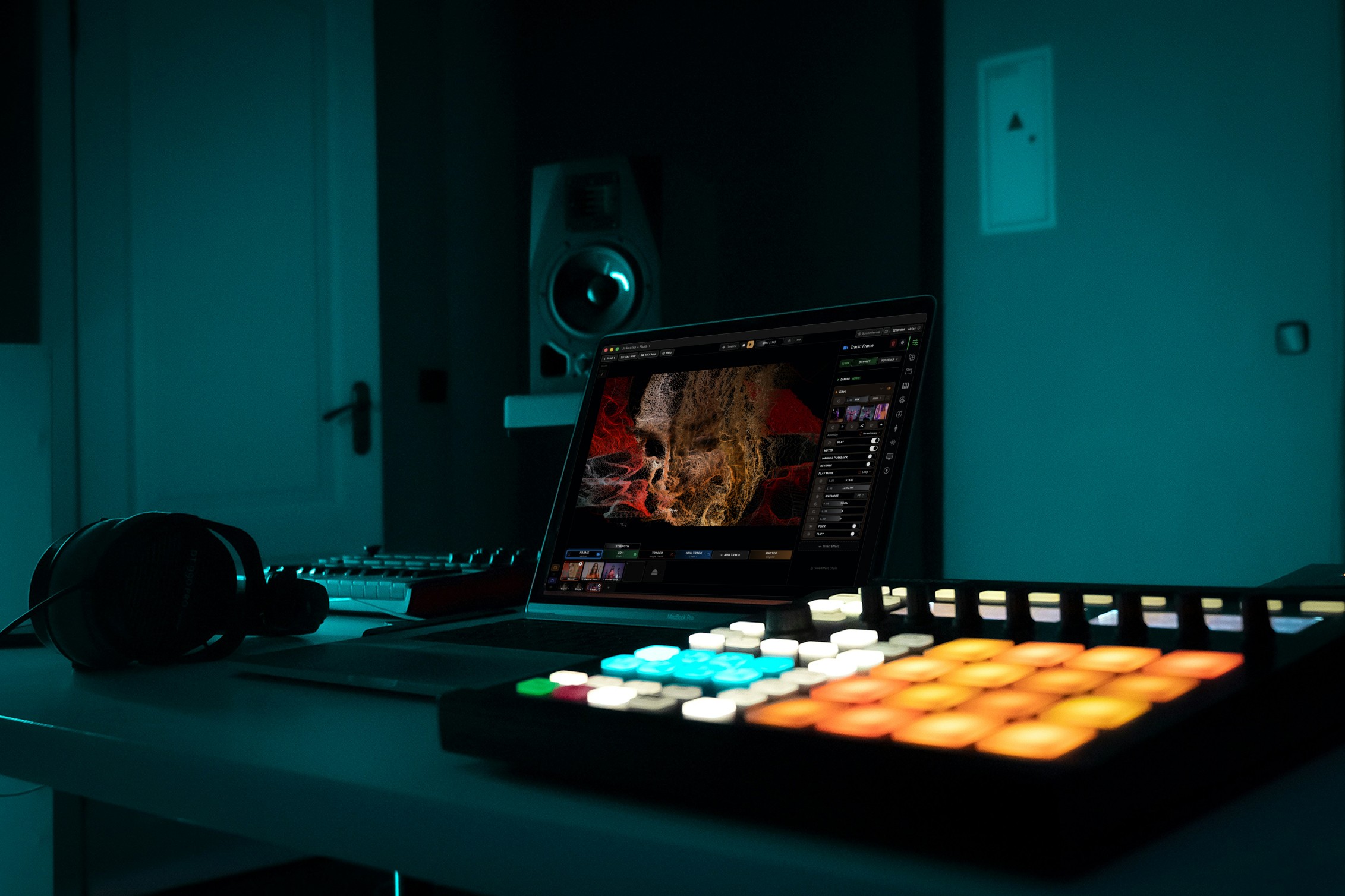
Powerful for the Stage, Simple to start today
Arkestra is our flagship application for real-time generative visuals, for VJs, musicians, DJs and creators all around the world